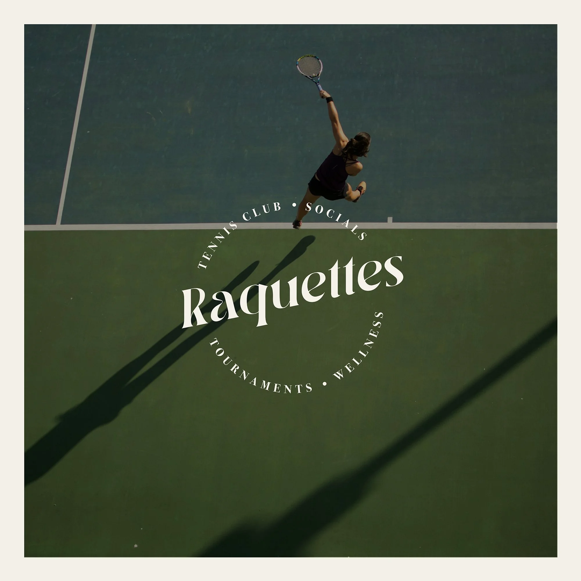
RAQUETTES
Raquettes are a Tennis and Social Club that I created as a personal branding project. The style is high-end and elegant, with a lot of style.
Think Palm Springs Country Club with a young, fresh twist.
BRANDING | GRAPHIC DESIGN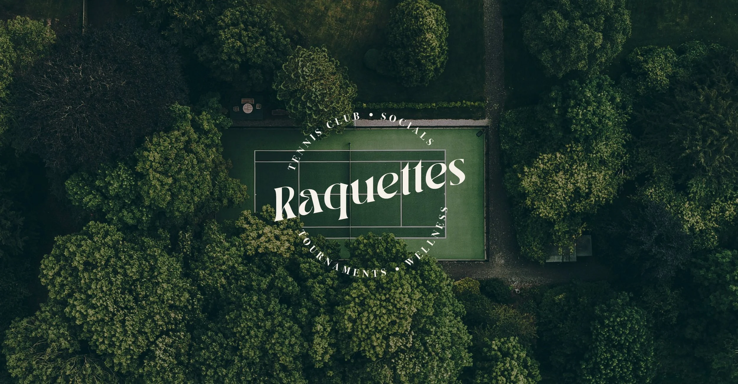
LOGO & MOODBOARD
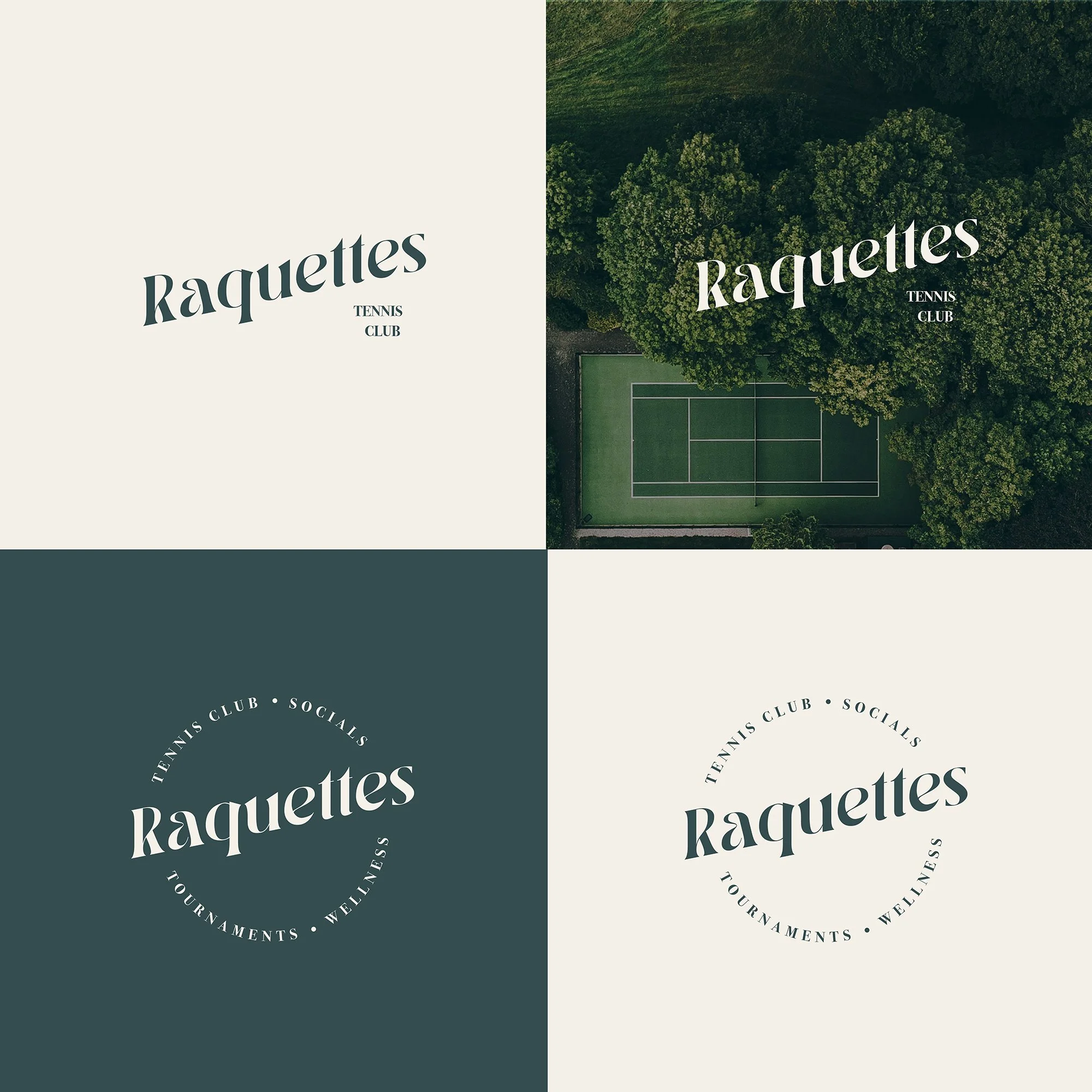
The logo is designed within a circular shape, featuring an ultra glamorous serif font. To determine the style of the brand a mood board was created, showing images of tennis, travel, leisure and timeless style. The aim was to create a feeling of glamour, wealth, enjoyment and prestige.

TYPOGRAPHY & PALETTE
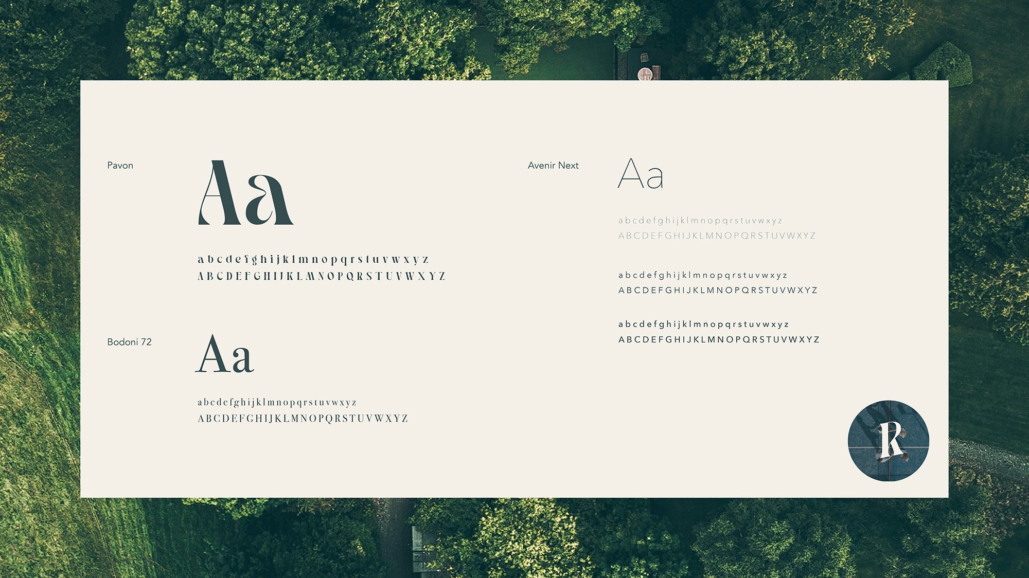
For large headings I opted for the font Pavon, which adds glamour and a bit of edge to the the brand. For sub headings I chose Bodoni 72, which keeps the style classic and high-end. And I have applied Avenir Next for all body copy for it’s elegance and super fine weight variations.
Teal, grey, green and blue shades make up the understated and classic colour palette, which helps to create a sophisticated, “old-money” aesthetic.


BRAND ASSETS
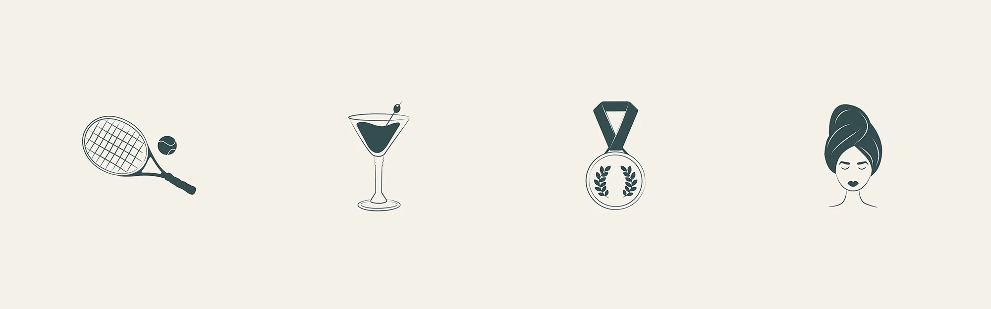
The letter R is used as an icon and logo alternative for the brand. This can be displayed within a circular shape within a solid colour or image. Main features of the club are displayed with the use of illustrated icons, which include Coaching, Socials, Tournaments and Wellness.